TWL Notes
These are notes on the Themable Widget Library
Analyzing the GameUIDemo demo application
The main application is itself a Widget, which is a fundamental class of the TWL library. Widgets can have children which are also widgets. In the GameUIDemo, all the buttons on the screen are children of an instance of the main application class.
public class GameUIDemo extends Widget
{
...
}
The main() method
In the main() method, LWJGL is started and initialized, and then an instance of the application class is instantiated:
public static void main(String[] args) {
try {
Display.setDisplayMode(new DisplayMode(800, 600));
Display.create();
Display.setTitle("TWL Game UI Demo");
Display.setVSyncEnabled(true);
LWJGLRenderer renderer = new LWJGLRenderer();
GameUIDemo gameUI = new GameUIDemo();
GUI gui = new GUI(gameUI, renderer);
ThemeManager theme = ThemeManager.createThemeManager(
GameUIDemo.class.getResource("gameui.xml"), renderer);
gui.applyTheme(theme);
while(!Display.isCloseRequested() && !gameUI.quit) {
GL11.glClear(GL11.GL_COLOR_BUFFER_BIT);
gui.update();
Display.update();
SimpleTest.reduceInputLag();
}
gui.destroy();
theme.destroy();
} catch (Exception ex) {
SimpleTest.showErrMsg(ex);
}
Display.destroy();
}
The first four lines are starting up and initializing LWJGL:
Display.setDisplayMode(new DisplayMode(800, 600));
Display.create();
Display.setTitle("TWL Game UI Demo");
Display.setVSyncEnabled(true);
Next, a LWJGLRenderer object is instantiated:
LWJGLRenderer renderer = new LWJGLRenderer();
Followed by an instantiation of the main application class:
GameUIDemo gameUI = new GameUIDemo();
Then a GUI object is created, and the constructor is passed a reference to both the main application class and the renderer object. It is in this step that the button widget objects are created and added as children to the main application instance.
GameUIDemo gameUI = new GameUIDemo();
Now a ThemeManager object is created, using an XML file in the call to the constructor. This XML file will provide instructions as to how the content will be displayed to the user.
ThemeManager theme = ThemeManager.createThemeManager(
GameUIDemo.class.getResource("gameui.xml"), renderer);
Then the 'Theme' is applied to the gui object.
gui.applyTheme(theme);
Now, the Gui object has references to the LWJGL renderer, the main Widget instance (GameUIDemo), and now the ThemeManager object which was initalized with the information from the XML layout file. The GUI now has all the information it needs to become operational.
Here is the main loop of the application. gui.update() renders all the controls using OpenGL, Display.update() tells LWJGL to update the screen. ReduceInputLag calls LWJGL to process messages, and polls the keyboard and mouse.
while(!Display.isCloseRequested() && !gameUI.quit) {
GL11.glClear(GL11.GL_COLOR_BUFFER_BIT);
gui.update();
Display.update();
SimpleTest.reduceInputLag();
}
The Main Application Class Constructor
Here in the constructor, the button widget objects are created.
public TWLHello() {
actionButtons = new ToggleButton[ACTION_NAMES.length];
for(int i=0 ; i<ACTION_NAMES.length ; i++) {
actionButtons[i] = new ToggleButton();
actionButtons[i].setTheme(ACTION_NAMES[i]);
add(actionButtons[i]);
}
btnPause = new ToggleButton();
btnPause.setTheme("pause");
add(btnPause);
btnArmageddon = new ToggleButton();
btnArmageddon.setTheme("armageddon");
add(btnArmageddon);
fpsCounter = new FPSCounter();
add(fpsCounter);
}
For each button widget, a constructor for a togglebutton is called with no arguments, thus creating a button with no position, size, or style information.
btnArmageddon = new ToggleButton();
Then the button has a 'Theme' set, which is just a string name. At this point, this does absolutely nothing but save the string in a member variable of the button. This string will be used later to find information within the XML file about how to draw the button.
btnArmageddon.setTheme("armageddon");
Finally, the button is added to the main application Widget object
add(btnArmageddon);
Now the button object exists, and it has a theme name specified which will locate information on how to draw itself from the parsed XML file, and will know where to draw itself when the layout() method of the main application class gets called.
The layout() method
The main application class overrides the Widget layout method. When the main loop starts, gui.update() calls this function to determine where the child widgets should be drawn.
@Override
protected void layout() {
int x = 10;
int y = 40;
for(ToggleButton b : actionButtons) {
b.setPosition(x, y);
b.adjustSize();
y += b.getHeight() + 5;
}
x = getInnerWidth() - 10;
y = 10;
btnPause.adjustSize();
x -= btnPause.getWidth() + 5;
btnPause.setPosition(x, y);
btnArmageddon.adjustSize();
x -= btnArmageddon.getWidth() + 5;
btnArmageddon.setPosition(x, y);
fpsCounter.adjustSize();
fpsCounter.setPosition(
getInnerWidth() - fpsCounter.getWidth(),
getInnerHeight() - fpsCounter.getHeight());
}
For each button, adjustSize() is called first, then setPosition(x, y). adjustSize() gets the button to adjust its size based on the preferred size, which hopefully was determined from the XML document. setPosition(x, y) simply positions the button on the screen within the parent widget, which in this case is the main application.
The Theme XML File
The theme XML file is how all the widgets determine their appearance and preferred size. It does not however spell out information on where the widgets should be drawn. That is determined by a call to the layout method of the parent widget. There are four main categories in a Theme XML file.
<textures> element
This section specifies a PNG file with one or more texture parts inside. In general an image can be broken up into several pieces and parts, each of which is displayed separately. This is necessary, because frequently 3D texture files are limited by the graphics driver to be sizes which are powers of two, and there are some limitations on how small a texture can be. The main <textures> section specifies the PNG filename, and the parameters which apply to file in general. Then within the <textures> section, there are <texture> child elements. Note this tag name does not have an 's' on the end, so it is a different element type than the main <textures> section.
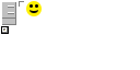
These child elements each specify a subsection of the main texture. There must be at least one <texture> section. Typically if there were just one <texture> section, it would specify an x and y start of 0,0, and a width and height of the entire image.
But if an image had several parts in it, maybe there is a smiley in the texture at pixel x=24, and y=1. In order for the smiley to be used, there needs to be a texture child element to specify the xy start location within the whole png file, and also its size in pixels.
The <texture> (with no 's') child element of <textures>
These child elements each specify a subsection of the main texture. There must be at least one <texture> section. Typically if there were just one <texture> section, it would specify an x and y start of 0,0, and a width and height of the entire image. But if an image had several parts in it, maybe there is a smiley in the texture at pixel x=24, and y=1. In order for the smiley to be used, there needs to be a texture child element to specify the xy start location within the whole png file, and also its size in pixels.
<texture name="smiley" x="24" y="1" width="14" height="14" center="true"/>
The <alias> child element
Sometimes you may have a texture which is used in several places for different reasons. For example, you might use the Smiley picture twice in your screen, once in a textbox, and again in another place alone on the screen. Maybe in one theme both smileys can be the same yellow smiley, but in your 2nd theme the textbox is light green and the colors clash. So the solution is use aliases to define two smileys which in one theme XML file both point to the same <texture>, but in the other theme, the aliases point to two different smileys with different colors.
For example,
<texture name="-smiley" x="24" y="1" width="14" height="14" center="true"/>
then have two aliases
<alias name="smiley_textbox" ref="-smiley">
<alias name="smiley_background" ref="-smiley">
Now when you actually use the texture in your widgets, you only use "smiley_textbox" or "smiley_background", and you never reference "-smiley" directly.
Another reason to use the <alias> tag is to use the same texture but with different properties. For example, consider the following:
<alias name="smiley_translucent" ref="-smiley" tint="#8fff">
This would be the same smiley texture, but with a different tint. In this cast the alpha value is divided by 2, and the r, g, and b elements are unchanged. Thus it should draw the smiley as half-transparent.
Frequently the <alias> tag is used to make an anonymous version of a <texture> with a different tint, or it is used with a conditional tag. For example:
<select name="button.background" border="6,3">
<alias ref="-borderB" if="disabled" tint="#8fff"/>
<alias ref="-borderE" if="armed" />
<alias ref="-borderB"/>
</select>
In this xml fragment, ther are three possibilities for drawing button.background. Instead of referencing three predefined named <texture> elements, three anonymous aliases are defined. If the button is disabled, then texture -borderB is used, but made 1/2 transparent. If armed, then a different texture is used.
The <grid> child element
Sometimes you'd want a texture to be stretched in different ways. For example, a simple box with borders can be created out of textures. One texture can be used for the border at the top, another one for the left and so on. Then a different texture can be used to color the inside of the box. Now suppose we wanted the box to be drawn at different sizes. We could scale all the texture sizes up and down, but that would end up looking very messy, with borders jumping from two pixels wide to three pixels, and maybe different borders would scale differently, leading to an ugly asymmetric box.
Using the grid child element, a square region can be divided into an array of rectangular areas, which scale differently when the entire region is resized. Consider the following fragment within a <textures> element:
<grid name="tooltip.background" border="4" weightsX="0,1,0" weightsY="0,1,0">
<texture x="30" y="50" width="3" height="3"/>
<texture x="33" y="50" width="24" height="3"/>
<texture x="57" y="50" width="3" height="3"/>
<texture x="30" y="55" width="3" height="20"/>
<texture x="33" y="55" width="24" height="20"/>
<texture x="57" y="55" width="3" height="20"/>
<texture x="30" y="77" width="3" height="3"/>
<texture x="33" y="77" width="24" height="3"/>
<texture x="57" y="77" width="3" height="3"/>
</grid>
The tooltip background is a plain box. Here the box is divided into 9 areas. We know there are 9 areas because weightsX, and weightsY both have 3 values, and 3x3=9.
There are four corner textures, each 3x3 pixels in size. Then there are the top, bottom, left and right border textures. Then in the center there is texture which makes up the interior of the box. Because the weightsX and the weightsY for top left corner are both 0, that means the corner texture will not change size at all as the box is drawn at different sizes. The top and bottom borders both have weightX=1 but weightY=0. Therefore, the top and bottom borders will stretch in the x direction, but will always be exactly 3 pixels in the vertical direction. The center area is the only one which has both weightX=1 and weightY=1. The center therefore will stretch to fit in both the horizontal and vertical directions. This way the box can be resized and still look nice even though textures are used for all parts of the box.
The <composed> child element
Many times it is handy to draw a button using two or more textures at once. A base layer provides a background or outline, and a foreground texture possibly with some transparent pixels is drawn over the top. This is what the <composed> element is for. Consider these two composed items:
<composed name="button.focused">
<alias ref="button.normal"/>
<alias ref="button.hoverframe"/>
</composed>
<composed name="button.pressed">
<alias ref="button.pressedback"/>
<alias ref="button.hoverframe"/>
</composed>
A composed element can be used like a texture, just like the grid. A composed element contains two or more textures, which will be drawn over the top of each other, with the first texture in the list being drawn first, and the others drawn in order afterwards. In the example above, both composed elements use button.hoverframe, but different versions of the other texture.
The <select> child element
This is the chameleon element. It selects a texture based on a conditional. The following button background will use one of three different textures depending on "armed", "pressed" or "hover" is true.
<select name="valuadjuster.button.background">
<alias ref="valuadjuster.pressed" if="armed | pressed"/>
<alias ref="valuadjuster.hover" if="hover"/>
<alias ref="valuadjuster.background"/>
</select>
The <fontDef> Element
This defines a font. See the official documentation for a good explanation of this element.
The <inputMapDef> Element
The <theme> Element
This is the most confusing of the theme elements. This is used to specify different appearances for different buttons, or can also be used to re-skin an entire screen. It works somewhat like cascading style sheets. As an example of what CSS can do, try a few pages at the CSS Zen Garden. The Zen garden website shows how the same content can be displayed in a huge variety of very different and attractive ways depending on styles.
So when a theme is used, it substitutes parameters of elements. So basically a <theme> element has children which are <param> elements and other <theme> elements. The <theme> element has a 'name' tag, and optionally a 'ref' tag. To explain how theme elements are used to create gui elements on the screen, let us go back to the GameUIDemo application.
How the Armageddon Button Finds its Images
When TWL needs to draw the armageddon button on the screen, it needs to look at the themes to find out which images to use. It will need two images, one for the background, and one for the overlay. What we will find is that the armageddon button is like a subclass of a more general theme called 'hbutton'. hbutton is used for all the buttons, and provides two possible images, a dark background, and a lighter one. Then later, when TWL has found and drawn the background, it then looks for the overlay image to draw on top of the background. It will then find a more specific image to use which shows a picture of an explosion. To learn how the button will actually use the theme data in the XML file to find the images, we must delve into the specifics.
This application has many animated buttons which animate when the mouse is hovering, and can have a dark background or a light background depending of if the button is selected or not. The appearance of the button and how the appearance reacts is all controlled by the gameui.xml file. By following the process that TWL uses to find the correct image to use for the Armageddon button, much can be learned about themes, wild-card substitution, and the select process.
Starting with the Code that Creates the Button and Sets the Theme
In the java code, the buttons are created in the constructor for the main application class, which is a subclass of Widget. In the constructor, the button is created and added to the screen with three lines:
btnArmageddon = new ToggleButton();
btnArmageddon.setTheme("armageddon");
add(btnArmageddon);
It is the setTheme("armageddon") command which tells the button what its appearance will be. We search the gameui.xml file for the theme named 'armegeddon' and this is what we get:
<theme name="gameuidemo" ref="-defaults">
( ... other stuff removed for brevity )
<theme name="armageddon" ref="hbutton">
<param name=""><image>button.armageddon.*</image></param>
<param name="border"><border>background.border</border></param>
<param name="tooltip"><string>ARMAGEDDON !!</string></param>
</theme>
<theme name="fpscounter" ref="label"/>
</theme>
So this major theme "gameuidemo" was actually used because the name of the application class was GameUIDemo. The class name was converted to lowercase letters and then the parser searched for a theme of that name. Then when it was time to draw the screen, TWL sees that this particular button has a theme string set to "armageddon". So TWL uses the gameuidemo them, and then armageddon theme. Now the 'ref' tag for the armageddon theme is hbutton. This means that the armageddon theme is going to use the hbutton theme as a base theme. So any param definitions made for hbutton will be present, and changes will be made from there. As shown below, hbutton uses a theme called 'button' as a base, which in turn uses '-default'. Here is the earlier code in the file:
<theme name="-defaults">
<param name="background"><image>none</image></param>
<param name="overlay"><image>none</image></param>
<param name="font"><font>normal</font></param>
<param name="textAlignment"><enum type="alignment">left</enum></param>
<param name="minWidth"><int>0</int></param>
<param name="minHeight"><int>0</int></param>
<param name="maxWidth"><int>0</int></param>
<param name="maxHeight"><int>0</int></param>
<param name="inputMap"><inputMap>-defaultInputMap</inputMap></param>
</theme>
<theme name="button" ref="-defaults" allowWildcard="true">
<param name=""><image>button.*</image></param>
<param name="border"><border>background.border</border></param>
<param name="textAlignment"><enum type="alignment">center</enum></param>
</theme>
<theme name="hbutton" ref="button" allowWildcard="true">
<param name=""><image>hbutton.*</image></param>
<param name="border"><border>background.border</border></param>
</theme>
So for the Armageddon button, since it specifically loads the theme 'armageddon', then it must use the following parameters:
all images: <image>button.armageddon.*</image> // from armageddon theme
border: <border>background.border</border> // from armageddon theme
tooltip: <string>ARMAGEDDON! !!</string> // from armageddon theme
textAlignment: <enum type="alignment">center</enum> // from button theme
(And there are bunch from the -default theme .... )
The Search for the Background Image
So now the button needs to be drawn. To be drawn, the widget needs a background image and an overlay image. The background image gets drawn first. TWL needs an image called 'background'. So in the armageddon theme, TWL is instructed to prepend 'button.armageddon.' to the image name. So it then looks for an image called 'button.armageddon.background'. There is no such image, so TWL looks at the 'ref' tag and sees the 'hbutton' theme. The 'hbutton' them instructs TWL to prepend 'hbutton.' to the name of the desired image. So TWL looks for hbutton.background.
Here are the textures related to the horizontal buttons in the XML file:
<textures file="hbuttonbg.png" format="RGBA">
<texture name="-hbutton.background.highlight" x="0" y="0" width="38" height="60"/>
</textures>
<textures file="hbuttonbgb.png" format="RGBA">
<select name="hbutton.background">
<alias ref="-hbutton.background.highlight" if="armed ^ selected"/>
<texture x="0" y="0" width="38" height="60"/>
</select>
</textures>
So TWL is looking for an image called hbutton.background. It finds the <select> element with that name. So now we have a match. Before the image is resolve to an actual texture, the conditional if="armed ^ selected" needs to handled. So if the button is armed or selected (but not both) then image is aliased to '-hbutton.background.highlight', which is a part of the file hbuttonbg.png. If the conditional is false, then the image resolves to a section of hbuttonbgb.png.
So to recap, TWL needed a background image for the armageddon button. It searched through the chain of themes, searching for an image which exists. The 'hbutton' theme instructed TWL to search for hbutton.background, which it then found as a <select> element in the 'hbuttonbgb.png' textures top level element. Depending on the animation state of the button, it either resolved to texture hbuttonbgb.png, or hbuttonbg.png.
The Search for the Overlay Image
TWL starts again with the 'armageddon' theme, looking for an image called 'overlay'. The 'armageddon' theme has the line
<param name=""><image>button.armageddon.*</image></param>
This instructs TWL to look for "button.armageddon.overlay". Now in the previous case, when TWL was searching for a background image, it tried to find a "button.armageddon.background" image, but failed, and therefore looked at the 'hbutton' theme. But in the case of the overlay image, TWL actually finds a <select> element with a name which matches "button.armageddon.overlay". This <select> element is part of top level "armageddon_anim.png" <textures> element. The code for this elements is below:
<textures file="armageddon_anim.png" format="RGBA">
<texture name="-armageddon-0" x="0" y="0" width="36" height="57"/>
<animation name="-armageddon-anim" timeSource="hover">
<frame ref="-armageddon-0" duration="100"/>
<frames count="13" x="36" y="0" width="36" height="57" offsetx="36" duration="100"/>
</animation>
<select name="button.armageddon.overlay" center="true">
<alias ref="-armageddon-anim" if="hover | pressed"/>
<alias ref="-armageddon-0"/>
</select>
</textures>
The <select> element instructs TWL to use the image "-armageddon-anim" if the button animation state includes 'hover' or 'pressed'. This means the animation of the explosion will run. If the state does not include 'hover' or 'pressed', then the image "-armagedoon-0" will be used, which just shows the first frame of the animate steady-state.